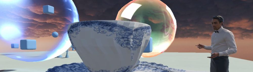
“But that is not logic!” she cried out about my latest creation. “I don’t care in logic!” I responded. “I am in the business of the irrational…”
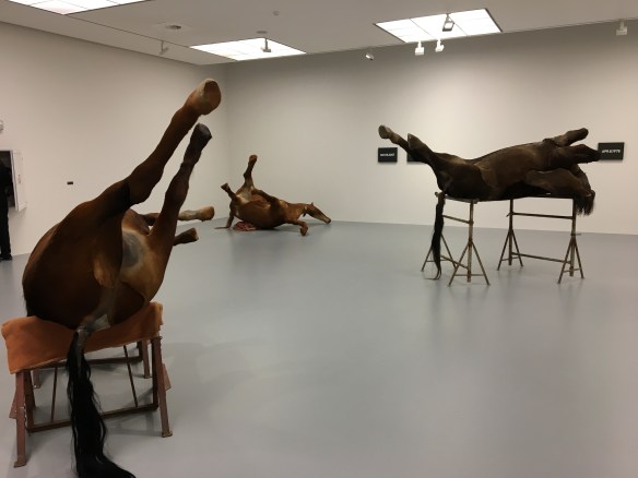
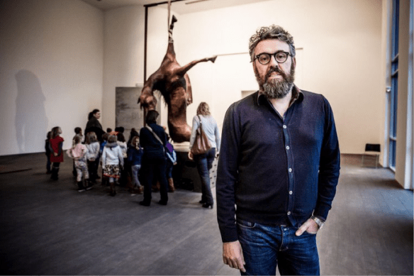
Horses by Berlinde De Bruyckere in Mukha
Part of Sanguine/Bloedrood exhibition on Baroque
I have something with – or better against – logic, facts, being normal. I am not really interested in doing things that are logic. They feel dry, life-less, un-emotional, un-spiritual, un-aesthetic, and too-efficient.
With the focus on facts (real or alternative), metrics and logic we witness the loss of the subjective.
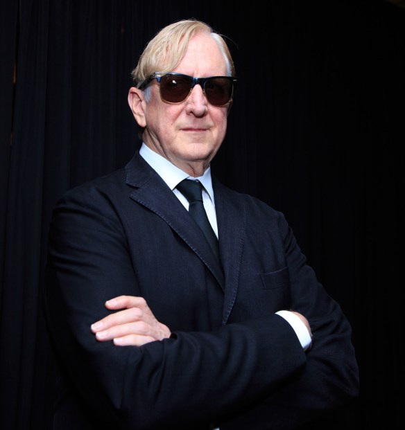
I was looking back into my “open threads” file – a collection of reflections, thoughts, interesting articles, links etc. – and found back this great quote from T Bone Burnett’s speech at the 2016 AmericanaFest.
T Bone Burnett by Anna Webber for Americana Music Association
“Technology does only one thing- it tends toward efficiency. It has no aesthetics. It has no ethics. Its code is binary. But everything interesting in life- everything that makes life worth living- happens between the binary. Mercy is not binary. Love is not binary. Music and art are not binary. You and I are not binary.”
In other words, technology, and by extension facts, logic, and AI, miss the notion of heart, mind, and spirit.
Apparently Japanese have a word for this unity: “kohoro”. This Quartz article points to the real difference between man and machine.
“The human heart is rich in intuition; it possesses attributes such as illogicality, hunger for novelty, creativity, infinity and openness. Computer simulation is deterministic (closed); it lacks diversity and is an embodiment of dryness. I believe that this is the decisive difference between computers and human beings.”
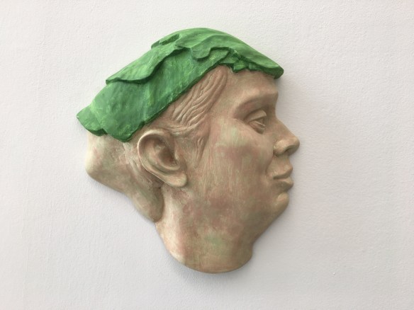
Sculpture by Thea Gvetadze in MUKHA, Antwerp
There is also a much darker side to the illusion of facts. Or when the devil manages at convincing people that only his facts are the real facts. Joe Edelman wrote a great post “Five days with the devil” about that about a year ago. With hindsight, this is such an important insight: how the devil of facts kills how humans interact:
By offering the to-do list, he reduced all values to logistical goals.
By replacing flirting and discovery with an enhanced coordination, he re-cast collaboration as a trade for goals, rather than a mutual exploration of values.
By offering us acute perception, the devil stole our ability to discover value in our environment. He convinced us only facts were real.
By offering us empathy and understanding, he removed our capacity to protect each other, which depends on recognising values.
By preventing us from sharing reasons, he cut us off from us certain social processes: from deliberation about values, from co-discovery of values. It’s exactly these social processes, which make our choices meaningful.
“He convinced us only facts were real.” Read that sink in for a moment. It’s like someone says, “Don’t believe what you hear or see, only believe my facts are real”.
Facts ignore that what cannot be measured, what is at level of meaning, beyond sense-making. It would be better to capture information, knowledge and insight at a more condensed level. Like in an artefact: an eternal repository of high quality information captured before its entropic death.
In his excellent book (Amazon link) “Strange Tools. Art and Human Nature”, Alva Noë confirms:
“What is at stake is not the facts. What is at stake is how we assimilate, make sense of and finally evaluate the facts”
In other words, the future is not about facts. The future is in the victory of the subjective, the nuance and the romance.
This is an essay (longer read) about maps. There is no big message, no purpose, no call for action, none of that. Just recording and documenting of some reflections about maps. I don’t know where it came from. Suddenly I had enough notes to try to make something coherent out of it. Hope you enjoy the trip.
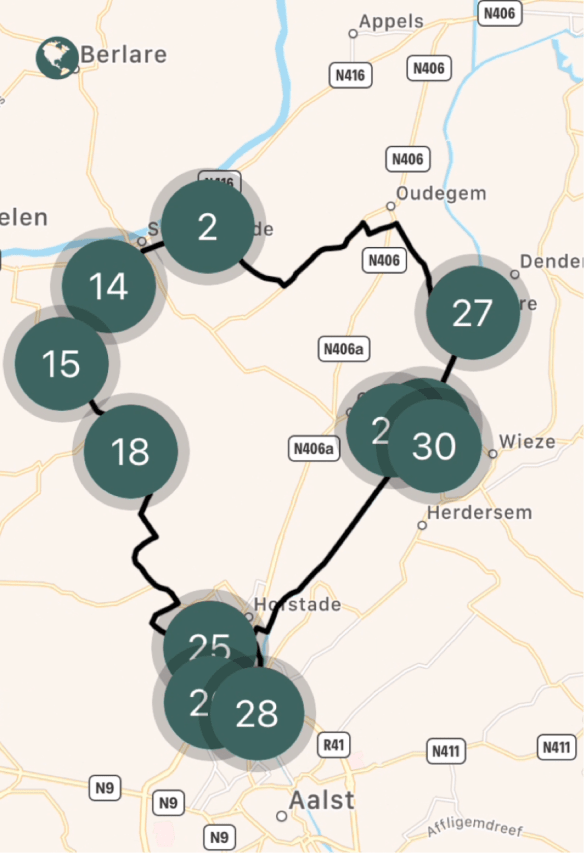
Modern Biking App Map – Notice point #27 – Denderbelle Lock
The theme of maps maybe emerged from my biking tours. Or from my recent tendency to do recordings: soundscapes – of probably better “silence-scapes” – of broken silence in nature. A sort of witnessing and documenting what was at that moment.
Maybe it emerged in preparing my upcoming performance for Finnovista in September: one of the themes is “learning” and I found that quality of observing says more about learning than teaching. So I used maps as a metaphor.
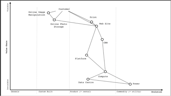
Simon Wardley - example of situational awareness map
Position on a map is often about geographical location and relations. But there is also the position in time: what was, what is, what can be. And like there is position of location, there is also position in time.
The time element hit me when I was bicycling along the river “Dender” and made a pit stop at the lock of Denderbelle. It’s a relatively small lock, and you can still walk over the doors of the lock to the other side of the river.
There I found this map on a tourism panel:
Old map of the area Aalst-Dendermonde – before 1769
Before 1769, the Dender was a meandering river that was very difficult to manoeuvre for ships. It was Charles de Lorraine – at that time Duchy of Brabant, Austrian Netherlands – who gave the order to straighten the meanders and build two new locks. Today, the river feels more like a canal that goes almost straight from Aalst to Dendermonde. It has a very well maintained towpath along silent borders, which makes it a nice bike trip.
Close to the lock, there is still the old ferry house, now inhabited by an artist. There was a chain pulling the ferry from one side to the other. Even today you can still see the stairs on the shore where people boarded.
Map of Days by Grayson Perry – 2013 – Etching 111.8 × 149.9 cm
Video with the artist Grayson Perry
‘A self-portrait as a fortified town, the wall perhaps my skin. Each day I worked on it I finished by marking the point with the date to highlight the passage of time in the production of art to reflect the forming and reforming of one’s identity. The ‘self’ I think is not a single fixed thing but a lifelong shifting performance. My sense of self is a tiny man kicking a can down the road.’
Grayson Perry
The map is an awesome alternative way to document one’s life. Richard Martin arguments that the question “what is your map” probably gives better answers on who you are than asking “What do you do?” or asking for your linear CV or portfolio:
“In the Map, Perry presents his complex personality and plural identity in the form of a walled city. Streets, buildings and other locales represent personal traits and behaviours, indicating a self-exploration that embraces both the positive and the negative, that poses questions, as well as providing answers, binding together truth and fiction. At the centre of Perry’s map is a labyrinthine garden, in which a figure walks, off-centre, pursuing ‘a sense of self’. Each time I look at the Map, either in a gallery or online, I question how my own version would differ from Perry’s. What words would I choose? What images?”
The same applies with the question “where do you come from?”. Should one say “a Chinese artist” or “an artist from China”? If you say “a Chinese artist” then you place the work of the artist in an ethnographic bubble, a cultural bubble. But when you talk about an artist coming from somewhere, you just connect the artist with a geographical starting point. I prefer the latter.
Map of Total Art by Qiu Zhijie – Ink on Paper – c. 5m length!
The work of Qiu Zhijie is fascinating. Check out this video interview with him and curator Davide Quadrio about the exposition ‘Qiu Zhijie: Journeys without Arrivals’ that was shown from 1 april – 24 september 2017 in the Van Abbemuseum in Eindhoven.
One year later, this video still resonates with me, so I made a full transcript of it, some extracts below:
Qiu Zhije is an artist, and he is producer, teacher, student, curator. He is a Master with capital “M” in Calligraphy. He is one of the most respected calligraphers in China.
As from 2010, I started drawing maps. If somebody asks me who I am, I answer I am a cartographer. Drawing maps is close to art, organizing exhibitions, teaching and researching. It is also writing. I feel it is a very multi-faceted way to show my talents as calligrapher.
For me, maps are a source of knowledge at arms’ length distance, knowledge you do not acquire on the field, but from the sky, like a bird’s eye perspective. Then you can move that knowledge on a flat surface, to understand the correlations between what belongs together. Things should not be understood individually, but in the context of their relation to each other. So maps have a lot of influence. Making maps is a way to re-establish the integrity of the world because they illustrate the correlations on how everything relates to each other.
Teaching has always been an important part of my life. By teaching I keep learning. I continue to actualize and renew myself. Although teaching takes a lot of time, it is never a loss of time. On the contrary, it allows me to learn. That’s why I define teachers as those who organize the process of learning”. I like to teach about things I don’t know much about. I like subjects that I am highly interested in, so we can dig deep to know more.
His work is extremely free of themes, but also so encyclopedic. And so easy to connect with the idea of museum as a collection of objects and things. At the same time, his work is also able to crush this idea of objects and really enter into a world of fantasy.
Maps are models. Maps mark the land, they are landmarks. They document the “land-scape”, as a sound-scape documents the sounds.
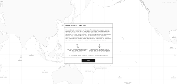
Phantom Islands – By Andrew Pekler – online experience, turn sound “on”
Andrew Pekler explains:
“The sweet spot for me is when a piece I have made can be simultaneously heard as both a field recording and as a completely composed, synthetic construct,”
Making maps is a sort of learning, a form of in-the-field-research and observation. Sharing with others what I am seeing, give context, some sense of coherence of position and direction/movement, and with some suggestions for maneuvering.
But in my case it is making pictures, writing and composing and creating a body of work from each trip. Field recordings, sound- and image-scapes like maps, at times creating a bizarre alienating, almost David Lynch kind of atmosphere, trying to resonate at another and additional level than the pure cognitive.
In that sense, I feel my current (art)work is getting closer to my real self, helps me to untether my soul, act as a witness, getting closer to alertness. With crispness, organic textures, precise rhythms,…
Natures Heartbeat – Online animation of earth’s heartbeat
In that sense, I am still doing the same as during my time as event curator. But the work is becoming more a documentary, a map, a set of interventions, interruptions and provocations that hopefully lead to higher states of alertness and aliveness.
Some kind of heartbeat that maps your open mind, heart, and will into a broader context.
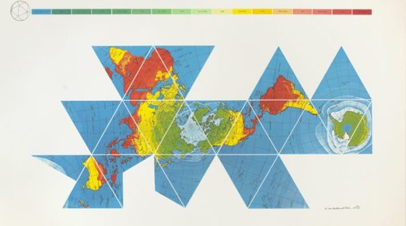
PS: Mark Storm suggested I add the Buckminster Füller Dymaxion Map. He is right! How could I – as a true Bucky fan – have missed this one? 😉
I am looking for some advice for an upcoming performance. I would like to feed the live stream of an iPhone6/GoPro/Drone to my Mac that is connected to the professional PA system of a conference center. Ideally wireless, aka my iPhone/GoPro/Drone etc. should not be wired to my Mac or another PA system. All indoors.
The person holding/operating the iPhone/GoPro/Drone (most likely myself) would walk around on stage and/or in the audience around a number of props and the video images should be fed in real-time to the main conference screen, ideally overlapping an existing PowerPoint/Keynote presentation. Audio from the video feed is not important/relevant. The audio soundscape comes from different software on my Mac.
There is nothing to report since my previous update of March 2018. I could have stopped here, but I didn’t and kept going. So, in case anybody would be interested, here we go.
This post is more a snapshot in time, of a period when nothing must or should. Where there are no more bosses, managers, and no deadlines. When time flows like the water of a slow river in its bedding. When there is time to be aware of the silence of the house when the family is still sleeping. When you start noticing the little sounds that break apparent silence. When there is time to notice the growth of the corn on the fields and the grass on the lawn.
The corporate jacket became too small to thrive; I needed the sort of freedom that Venkatesh Rao recently described in his post:
“Freedom lies in the privilege of being able to solve a problem for aliveness, rather than money”
Although problem solving is not good enough. As Nora Batenson wrote:
“The problem with problem-solving is the idea that a solution is an endpoint.”
Problem solving is reactive; creating what you want is pro-active.
It feels like I am pivoting. When time flows well, I create interventions, interruptions and provocations that lead to higher states of alertness and aliveness. Formats can be artwork, installations, performances, immersive learning experiences, writings, soundscapes, recordings, documentaries, or just casual conversations.
I feel privileged to create what I want to create, and to be able to apply the A.F.E.A.R. principles at will.
Family
It’s almost a year now since we settled in our new house, including my little art studio. And it still feels it was the right thing to do.
On May 1, 2018 we celebrated our 25 years of marriage. We went out for dinner with our parents to thank them for giving us birth, care and opportunities. Thank you Mieke for your endless patience with this always-unpredictable guy, your care, and your encouragements when doubt creeps in.
Astrid is doing very well at school. And she is starting to show first signs of her puberty, especially developing her little character 😉
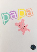
She made this nice little paper rabbit and greeting card for my father’s day:
The Artschool Project
The 2017-2018 Art Academy year has come to an end, and I already blogged about my latest work in The Story of 4 Paintings.
On March 31, 2018 I also participated for the first time in my life in a pre-selection of an art competition. The competition was called “De Curieuze Collectie” (The Strange Collection). My coaches had encouraged all students to participate. Only a few did.
Philippe Van Cauteren – Artistic Director S.M.A.K.
The jury was a quite eclectic mix, and included some people you normally don’t have access to like for example the Artistic Director of S.M.A.K. (Museum for modern art in Ghent). So I though why not, let’s give it a go.
This year’s theme of the collection was “Vox Populi – Populism in times of social media”. I presented some of my “Hot Dogs Tonight – Prison Window” work.
To make a long story short: I did not make it to the last 10 finalists. But it was a good experience to present in front of a select jury and a very diverse group of artists and locals. With hindsight, I feel that I tried to say too much, tried too hard not to be obvious: some level of vanity, which shows also in the background text I submitted to the jury (and a bit embarrassed now…)
“Hot Dogs Tonight” depicts a social media based panopticon, where the citizens are subject to continuous surveillance by governments, organisations and institutions. Attacked in their privacy, the citizen only sees the familiarity of her own cell. The convenience of the social media leads to an illusion of options, limited by the populist discourse of political demagogues. The Vox Populi becomes a Vox Populistus, a myopic view of reality, a fragmentation of time and identity. This lack of protection and security causes eventually a loss of personal leadership, courage and risk.
On June 12, 2018 I presented my Jan-June work for year-end evaluation at the academy: the latest work of The Story of 4 Paintings and some of my “Hot Dogs Tonight – Prison Window” work, especially the World Clock installation (physical version).
Next year, I will probably do some sort of specialisation or crossover, as I very much enjoyed the combination of digital and canvas this year.
About Silence
Some years ago I was diagnosed with auditory hypersensitivity, which in laymen terms means I hear extremely well. I hear for example the blood streaming through my veins in my head. It’s a soft rustling, but not very disturbing, no worries. On the other hand, I can’t stand television sets playing too loud, or the sound of the highway in the distance, or the crowds in subway stations. But I do like a loud rock concert or performance. “Functional loudness” if you want. So let’s say I am hypersensitive to noise pollution.
It dawned to me only recently that I could actually do something with this sensitivity. I started recording silence. Or rather, I started recording the noise pollutions that are disturbing a wonderful silence. Like the sound from a small motorcycle in the distance, passing by, and Doppler effect disappearing on the other end. Same with planes, trains, bicycles, voices, the list goes on.
Like in painting, it feels that this is also about managing contrasts and the spectrum of contrasts: loud/soft conversations, light/dark, calm/wild,….
Some of these recordings include video, some not. I plan to use some of these “silence-scapes” in my upcoming performances and/or installations as well. It’s a bit weird. I may get myself a GoPro camera and some decent audio gear, although my iPhone 6s captures it quite well. For the video below, I was just holding my iPhone in my hand when driving. Simple.
Biking noise and silence.
An 8-minute raw non-edited capture of a bike tour
in the area of Aalst (Belgium), illustrating sound and silence
To be used in some upcoming performances.
About time
My tempo has become so slow and peaceful that it starts to be incompatible and dysfunctional with the rat race of so called “normal” life of deadlines, busyness, and fragmentation of everything.
That’s what I wrote a while ago as some reflections on this theme.
Jan Fabre self-portrait - Part of series "Promises of a Face"
The first occasion where this dysfunction hit me was during a visit to the Museum of Fine Arts in Brussels, where my cousin is senior curator. He just had curated and opened an exposition confronting contemporary multidisciplinary artist Jan Fabre with the (mainly Flemish Primitives) classic artists (see also below). He gave me a quick-guided tour on the latest at the museum. I could not follow him (mentally). In one-hour time he gave me so much information, it seemed to me that I couldn’t process it all anymore, I needed more time to let it fully come in.
Around the same period, I was picking up again my Ableton skills ànd reading Venkatesh Rao’s “Tempo: Timing, Tactics and Strategy in narrative-driven decision making”, describing virtuoso how “tempo” is an always present but less outspoken aspect of our relationships between people, corporations, etc
In that book, he categorised some archetypes of tempo synchronisation. Some examples look very much like Gantt Charts.
Extract book "Tempo" by Venkatesh Rao
The tempo intervals made me associate immediately the visual metaphor of the “Venkatesh Gannt Charts” with the user interface of the music composition software Ableton Live (that I use to compose soundscape for my performances).
Especially the Ableton “session and arrangement view” visualizes in a very similar way the bars, tones, pitches, rhythms, tempos, velocities, automations, and quantizations of an arrangement or musical composition.
Ableton Live music software – arrangement view
One also hears intuitively when the score is right or not so right. When the beats are too digital and lack human variation. Life is more than bits and bites and rhythms in an arrangement…
Again, like in painting, it feels more and more that my work is about managing contrasts and the spectrum of contrasts: loud/soft conversations, light/dark, calm/wild,….
Exhibitions
Still trying to visit an art exhibition once/twice every month. During the last 3 months, I went to see:
“Het Vlot” a multi-location exhibition in Oostende
“My Queens” by multi-disciplinary artist Jan Fabre, honoring the 8 important women in his life in a dialogue with the Flemish artistic tradition (curated by my cousin Joost Vander Auwera). I was very impressed by the monumental Carrara marble bas-reliefs with incredible detail
“Fernard Léger – Beauty is Everywhere”, about one of the best-known modern artists, and a passionate observer of a bustling century, and the Cambrian fragmentation of everything.
Upcoming performance
I am very excited to have been invited again to do a performance at the Finnovista Summit in Mexico-City on 12-13 Sep 2018. I was invited last year, but the event needed to be cancelled halfway due to the 7,4 magnitude earthquake on 19 Sep 2017. So the organisers were so kind to invite me again.
The theme of this year’s event is “Listen, Learn, Lead”. Manoeuvring through this theme, I will make a new performance, recuperating some material from last year, but also with new elements from my artwork series “Prison Window” and other metaphors capturing my reflections and insights of the last year. This time, and in addition of the multi-media approach, I plan to include props on stage, possibly a life camera feed, even some vestimentary attributes, and a lightning script for the light technician.
The venue is indeed fantastic: it is the main concert hall of the Centro Cultural Roberto Cantoral, a real theatre stage with all the audio/lightning whistles and bells one can dream of.
The working title of the performance is “Get out of the prison cell! – An artistic reflection on listening, learning, and leading”
Chickens and Pigs Project
A nickname for our garden and chicken farm.
The chickens are doing fine, thank you. Normally 2-3 fresh eggs everyday, but recently – because of the warm pre-summer here in Flanders – one of my hens is broody. I told you, I have nothing to report 😉
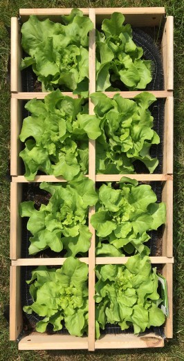
The garden is developing well. We now have different salads, tomatoes, cucumber, zucchini, carrots, paprika, berries and raspberries. And the trees in the orchard start developing apples, pears, cherries, and prunes.
That was just in the garden. Small stuff compared to what my uncle Hubert and son David are doing. They are professional farmers cultivating several hectares of land and keeping a livestock of about 250 cows and sheep.
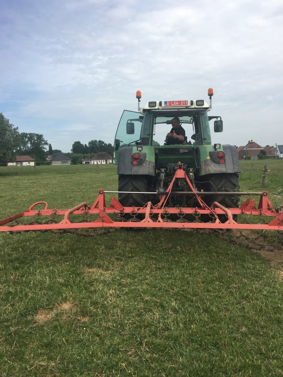
One of my long time bucket list items – driving a tractor through Flanders’ Fields – finally became true. It is an almost Zen-like experience to make nice straight lines in open fields, with just the sound of the tractor and the warm wind blowing through the open window of the machine.
Farmer Petervan on tractor of uncle Hubert, Aspelare, Belgium June 2018
I was impressed by the technology on board of these modern tractors. They have a joystick, auto speed control, airco, etc. and some of them even have GPS to make really straight lines, or to ensure no part of the land is sprayed twice, a matter of efficiency and cost control. Also the seats are awesome, better than in most cars.
I also learned a lot about nature: when cows keep their tail up, it means there’s thunderstorm underway, and when swallows fly low over the pasture, there is a good chance of rain coming. We also saw a lot of hares, and even a fox.
What’s next?
Besides the obvious year-end resolutions (renewed every quarter or so), the plan for July – Sep 2018 is to work on:
V1 of “Casual Conversations” aka Studio Oxygen
Make and publish some more Silence-recordings
Create 1 painting every 2 weeks > 6 paintings in 3 months
Write 1 blogpost per month
Mexico Sep 2018: make and rehearse the new performance
Looks like I am running out of time 😉 So, that’s it for this edition. If there is something worth reporting, next update is for Sep 2018.
This list of unspoken data is intended to be read in conjunction with my post on “The Selfish Data”
I want to get rid of the delusion that our social profiles are real and that we “don’t have anything to hide”. We are also a container, owner, custodian of many thoughts, concepts, ideas, habits, etc that we wish to protect, to keep intimate, to keep inside, to keep secret. Maybe that’s the real objective of privacy.
These are the data you take with you in your graveyard. They are not passed on to next generations like a selfish gene.
The unspoken dreams
The unspoken frustrations
The unspoken fantasies
The unspoken weird thoughts
The unspoken desires
The unspoken memories
The unspoken secrets
The unspoken shadows
The unspoken wounds
The unspoken joys
The unspoken likes/unlikes
The unspoken emotions
The unspoken jealousies
The unspoken failures
The unspoken loves
The unspoken trusts/distrusts
The unspoken masks
The unspoken narratives
The unspoken journal notes
The unspoken games
The unspoken phobias
The unspoken fears
The unspoken spaces
The unspoken dominances/submissions
The unspoken psychotics
The unspoken obscenities
The unspoken forbidden areas
The unspoken losses
The unspoken hates
The unspoken skin problems
The unspoken health concerns
The unspoken pathologies
The unspoken pardons
The unspoken little physical pains
The unspoken disorders
The unspoken shames
The unspoken lusts
The unspoken bodies
The unspoken vanities
The unspoken delusions
The unspoken disorders
The unspoken scandals
The unspoken doctrinal inconsistencies
Feel free to add more in the comments section of this post. If appropriate, I will add them to this initial list.
Some days ago, a Google video “The Selfish Ledger” leaked: a futuristic thought experiment on how total data collection could reshape society. I believe it is a very interesting perspective on data collection that can lead to as many utopian as dystopian scenarios as you want.
There was an excellent coverage in The Verge, well done, so read that one first maybe. The same Verge article also includes a good context video here.
What I would like to offer here is a somewhat broader perspective on the whole issue.
The use of the word “Ledger” reminds me of course of the 2012 Digital Asset Grid project – in essence a collection of distributed ledgers of all sorts of data (not only personal data), a blockchain without blocks and without chains – that was already incorporating concepts like the intention economy of Doc Searls. With some goodwill one could interpret the “Resolution” concept in the Google video as some sort of intention.
In 2012 there was maybe a time window where Personal Data Stores could offer an alternative to the almighty GAFAS of this world, but that time has long been gone. The Google video also shows how outdated the GDPR legislation is. Today is not anymore about users giving consent, but about data having its own life and will. I could paraphrase Kevin Kelly’s “What does technology want?” into “What do my data want?”. Not that I believe that my data wants anything at all, but it gives you a zest of Google’s thought experiment.
The key snippet from the video is where the human becomes the custodian – not the owner – of the data ledger, and can pass it on to next generations. The video suggests that data has it’s own intention, an intention to survive and pass on information to next generations. Like the Selfish Gene of Richard Dawkins (a book from 1976 ! that is also referred in the Google video). The Selfish Gene was published more than 40 ago, and since then the ideas of Dawkins have been quite critized.
The Google film also has a bit of the same alienating atmosphere, uncanny valley feel of Andy Curtis documentaries. Of course the documentary “The Century of Self” is the most relevant in this context.
It’s a series of 4 videos, together more than 3 hours of footage, but I strongly encourage you the watch it with the Google video as reference point.
Curtis depicts “how those in power have used Freud’s theories to try and control the dangerous crowd in an age of mass democracy.” and refers a lot to the PR techniques developed at the time by Edward Bernays, who was using the corporate PR techniques, but now for governments wishing to influence the behaviour of their citizens.
Curtis also cites the words of Paul Mazur, a leading Wall Street banker working for Lehman Brothers in 1927:
“We must shift America from a needs- to a desires-culture. People must be trained to desire, to want new things, even before the old have been entirely consumed. […] Man’s desires must overshadow his needs”
The Google video seems inspired by that desire to train people to desire, whether that is buying stuff or realising resolutions. Still very much looking at the user as a consumer, which is an insult IMO. It also starts feeling very much like the Sesame Credit score, the Chinese government social rating system, a private credit scoring system developed by Ant Financial Services Group, an affiliate of the Chinese Alibaba Group, where in essence behaviour in line with the party line is rewarded, and behaviour not in line with that norm is punished. The critical question is of course who sets the norms and what are the intentions of those issuing these norms.
Also, what many discussions about personal data seem to omit, is that the data that are intentionally or unintentionally shared by users are only a very small snapshot of somebody’s data “ledger”. A lot is not shared at all: I would refer to these data as “The Unspoken”. The ideas, thoughts, concepts, models, desires, fears, etc that are unspoken, because they embarrass you, or because they have not yet been integrated in your personal narrative of who you are.
The Unspoken data are related to unspoken dreams, frustrations, fantasies, weird thoughts, shadows, memories, etc. In many cases personal secrets that you are too afraid to share as they expose your vulnerabilities. I have started making a list of The Unspoken that you can find here, and I kindly invite you to complement this list if you feel so. Who said again that “If you have something that you don’t want anyone to know, maybe you shouldn’t be doing it in the first place.”?
On another dimension, I have been reading quite recently a couple of books that at first sight may seem unrelated to the subject at heart here.
Michael Singer’s “The Untethered Soul”: about the timeless philosophical question “Who am I?” and more importantly, which “I” are we talking about here. The “I” of our thoughts and emotions, or the “I” that is witnessing them?
Keith Johnstone’s “Impro: Improvisation and the Theatre”: highlighting how people try much too hard not being obvious, and how many people think they are only interesting of they have something different to show, share, say.
Han Kang’s “The White Book”, with an essay about swaddling white bands around a newborn baby: “The womb will have been such a snug fit, so the nurse binds the body tight, to mitigate the shock of its abrupt projection into limitlessness. Person who begins only now to breathe, a first filling-up of the lungs. Person who does not know who they are, where they are, what has just begun. The most helpless of all young animals, more defenceless even than a newborn chick.”
The Google video is also inherent of Silicon Valley’s solutionism delusion; that if there is a problem to be solved, there is an app or an algorithm for it. This is finite game thinking as compared to infinite game thinking, as well described by James Carse.
I like Nora Bateson’s quote here:
The problem with problem-solving is the idea that a solution is an endpoint.
And further in her book:
I see a great deal of misunderstanding—a great deal of information floating around, and even more being generated in the form of big data, little data, medium data. But not much in the forms of the warm data of interrelationality.
“Warm Data” is information about the interrelationships that integrate elements of a complex system. Information without interrelationality is likely to lead us toward actions that are misinformed, thereby creating further destructive patterns.
“Warm data”, I like that. I prefer that way more than selfish data.
The 2017-2018 Art Academy year is coming to an end, and on June 12, 2018 I will present some of my works for the year-end evaluation. Good that I kept a logfile of the evolution of most of my paintings; it helps me reflect on sources of inspiration, different stages of decisions, and lessons learned. Some friends encouraged me to share these stories, for some reason they find them interesting.
So here is the story of 4 paintings:
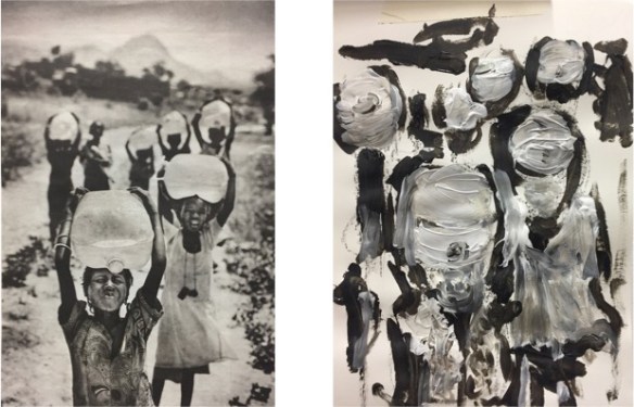
Painting 1: Watercarriers
This is actually a series of paintings. The inspiration was a 2007 newspaper picture of children carrying water to the refugee camp in Tsjaad (I have a file of “interesting” pictures that I keep somewhere in a drawer and/or electronic file).
On the left the picture, on the right the very first sketch on A4 paper. This was one of the first big lessons learned this academy year: my coach Chris told me “and now, never look back at the original picture, and base your work on the sketch, on the memory of that picture”. In other words, it was not so important to create a realistic reproduction of the picture, it was more important to transmit the impression.
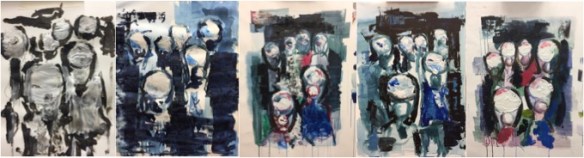
During that time, we also got some basic training in making grey tones of colours, and I made a series of those (read from left to right). The sketch on the left is on A4 paper, the one next to it is on paper A2 format, and the others are on canvas about some A2 size.
Painting 2: Blue Boat
Inspiration this time from the on-line coastal sciences and societies Hakai Magazine: an article titled “The secret language of ships” got my attention. Many great pictures that could be used as basis for a painting, but I took this one:
I started out with the lesson from painting #1 in mind: “and now, never look back at the original picture…”
First iteration on the left. I was quite happy with the sky, and had some fun by turning the canvas 90° and dripping paint to get some fluid effect. The very first version of the tugboats also appeared in this version, happy to see that with just a couple if lines it is possible to create the impression of a boat.
My coaches are too gentle, but the main feedback was that it all felt a bit too busy, and I should try to get rid of that sky and make it much more neutral. So I made it grey-white. Next, I added some white line on the body of the big tanker to improve the perspective effect. In the fourth picture you will see I tried to calm down also the sea surface. And at the far right (and below) the final result with purple sky, better tugboats and reflections in the water.
Big lessons learned:
A couple of lines are enough to create an impression
Calm down, avoid gimmicks, don’t distract but create calm by big surfaces
Create calm (repeat)
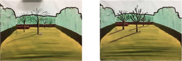
Painting 3: Cowbow Henk in his Garden
Inspiration was this picture of a person in a rather large garden
I started out as usual with some solid general structure foundations (first picture on the upper left below):
Then, I tried – within my basic skills – to do some impressionistic representation of reality (2nd picture). The feedback from my coaches was consistent: “EVERYTHING screams!”. So the first step I took was to “neutralise” the lawn. By pure accident – I did not see it at first, it was Frieda, a co-student – I got some sort of “Trompe l’Oeuil”: it was as if the lawn rolled out in infinity in the front of the painting.
In the second row, first picture, I painted over the back and sides with a calming light-greenish colour. A mix of brush and spatel. And added the black border line. Then I tried to remember principle #1: bring some rest in your work! Something important happened in third row, first picture from the left.
I started playing with digital. I imported my last result into Sketchbook Pro and tried different alternatives, using multiple layers and turning them off/on until I had a result that I somewhat liked. You see that result below in the picture on the left. The I tried to apply the digital design onto the canvas with real brushes and paint. The end result is on the right below.
I named the painting “Cowboy Henk in his Garden”. If you do not know Cowboy Henk, he is a strip character by Kamagurka and Herr Seele, two absurdists from Absurdistan, in good neo-Magritte surrealism. Check out for more background here. To be honest, I don’t think it’s Cowboy Henk in his garden, but his brother Dikke Billie Walker – the anti-hero of Henk – or another absurd family member…
Lessons learned:
don’t scream all over the place
create calm (repeat)
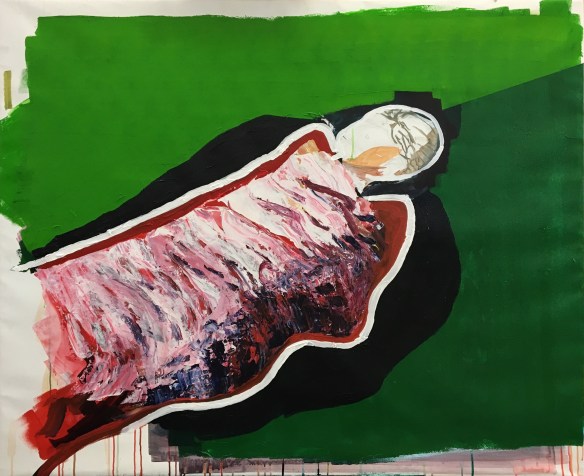
Painting 4: Trampoline
Good example of a painting that makes sense at the start, but alienates the audience when it is truly finished.
The source inspiration was a picture of my daughter laying on a trampoline, wrapped in white linen sheet, during a warm summer day two years ago.
You can easily follow from left to right, row after row, how this painting evolved.
Important steps IMO are:
Row 1, step 3: adding of a solid green trampoline border
Row 2, step 2: draping a real white sheet on top of the painting to see/study the shape and shadows of the blanket
Row 2, step 3: adding the folds in zinc white. After that step, I did not touch the painting for about 5 months. Then, suddenly, I painted over the white with some red’ish folds, and put some green-yellow accents above/below the mummie, which I painted over right away in the next session
Row 3, step 2 is a digital mix. Again, I imported the previous image in Sketchbook, and experimented with a lot of variations, including feathers on the head of the mummie (not shown below), but in the end I liked the result below:
On the left the digital composition, on the right the real painting on physical canvas. So, digitally, I adjusted the two green backgrounds, added a dark shadow around the mummie, got an extra red line, and finally, drew the white line around.
So, this was the end-result. Like most paintings above, all is acryl on canvas, and the format is 120x100cm, except when mentioned otherwise.
Lesson learned:
Feel free to experiment with digital
create calm (repeat)
With sincere thanks to my academy coaches Chris, Pieter, Koen, Inge, Marie-Ange, and Annick