
Artschool 2017: Petervan Doig trees on top of Zaha Hadid MAXXI space Rome.
Acryl on cotton canvas, 90*90cm
Artschool 2017: Petervan Doig trees on top of Zaha Hadid MAXXI space Rome. Acryl on cotton canvas, 90*90cm

Artschool 2017: first evolution of painting with Zaha Hadid space
as inspiration - Acryl on cotton canvas, 90*90cm
I recently had some conversations with prospective clients on the need for alignment and coherence of physical and emotional space when trying to create great experiences. I started to call them “sacred spaces”.
As you know by now, I am not in the events business. I am in the business of creating high quality feedback loops to enable immersive learning expeditions and deep change. In essence, I want to resonate with my client’s guests at another (additional) level than the pure cognitive. I believe this ambition also requires its own awareness and vocabulary, but more about that in some later posts.
One aspect of that vocabulary is our expression of sacred spaces. What first comes to mind is a church, a cathedral, some religious building of some sort.

Sagrada Familia – Barcelona – 31 Oct 2014
In the best cases, the moment you come in, you are struck by a lightning of beauty, awe, stillness, and grandeur. The entry into the space feels almost ceremonial. You cross the entry, the line between outside and inside. The experience of the space sends vibrations down your spine. You feel suddenly whole and small at the same time.
This whole- and small-ness creates some kind of safety; some form of familiarity that this space is the right space, that this space is right. Just right for what it was designed for.
I think in similar terms about the spaces for our experiences.
Our spaces must be safe spaces. Closed as with an entry door. The entry into the space is a ritual moment. The coming out as well. It must be a physical experience: guests have to walk through the “arc of change”. They must do this in a “communion” style, as a collective, creating a visceral experience of the collectivism in their change process.
The space is about “roundness”, round as in circle, but also round as in generative, coming back to the starting point with new insights.
The space becomes a pulsing “egg”, a “womb” that will be our “nest” for a couple of days. It has of course to do a lot with right spaces for humans, and Jean Nouvel’s views (video here) on architecture. The video is also called “Reflections”, just like the latest from Brian Eno, one ambient song of 54 minutes (interview here)

“Combining big bold shapes with intricacy and delicacy. The ability to be bold and delicate at the same time. The relation between time and light. The sphere above, the cupola. A spiritual space.”
I love the idea of the cupola. In my opinion, the closed space described above needs a roof – like a cupola – with some lattice membrane. But at the same time, the space needs to be “porous”, with light (the crack) coming in through the lattice, and light (enlightenment) coming out to inspire others. Or even better, some form of post-enlightenment as in Danny Hillis’ entanglement.
And light itself can also be the “roof” and the trees of the space forest. Check out this wonderful video of Fujimoto’s light forest:

I shared the video with my good friend Marti Spiegelman, who replied:
“Thanks for the link – this is extraordinary. It reminds me that sometimes the light itself is the sacred space – I’m thinking of the light beam on the floor, when one of the walkers stands in the light – and sometimes the light creates the boundaries, or defines the edges, of the space – as in a forest when there is a small round clearing, it’s traditionally considered to be a ‘power spot’’ [another name for sacred space] where you can call in greater powers of nature and the universe to create change.”
I was looking for some good description of sacred and sacredness. I think I found it in an article about a fashion book by Belgian fashion designer Ann Demeulemeester.

“It looks and feels almost sacred, with pages so thin the images can be seen on both sides of each sheet; it’s a truly delicate beauty. For this reason, every single page is printed only on one side, creating a uniquely singular reading experience. The size and weight of the book gently contrasts with the fragility and smoothness of the paper, while the almost total white of the inside is in opposition with the blackness of the sides and the linen cover. Text is kept to the essentials, limited to an introduction by Patti Smith (Demeulemeester’s longtime muse) and a short final dedication by the designer herself. The book was designed by Victor Robyn, a Belgian graphic designer who has been in charge of realizing Demeulemeester’s graphics for years—from show invitations to printed fabrics. The art direction is curated by Victor Robyn, Demeulemeester herself and Patrick Robin, her life and business partner.”
Happenstance that I visited this week Casa Argentaurum, an art gallery in Ghent run by Caroline De Wolf, who kindly opened her space for me. It was one of the last days of the exposition about Ann Demeulemeester’s jewellery.

Necklace – Ann Demeulemeester – Casa Argentaurum
At the end of our conversation, Caroline gave me a copy of the catalogue of the 2010 exposition “Things, Thoughts, and Territorities”.

The book has some great design drawings by Andrea Branzi, and also a wonderful testimony of the artists’s love relation with Belgium (mostly Flanders btw). Somewhere half way, there is this superb quote:
“Architecture is not the art of building, it is a very complex discipline,
interpreting history, technology and the changes in society.”
It could have been the tag-line for Petervan Productions, as I see myself as the architect who conceives, gives birth to the vision together with the client, and then pulls together and orchestrates the resources, experts, and artists to create a unique experience in search for the secrets of life.
But “you can’t find secrets without looking or them” (quote by Peter Thiel in his book “From Zero to One”), so I am looking for your views on what you would expect from a sacred space.
I am looking for architects, space- and stage-designers to be part of our collective of leaders, visionaries, artists, craftsmen, designers and producers.
If you are interested to be part of that calling and dialogue, you can just leave a comment on this post.
Rebelliously yours,

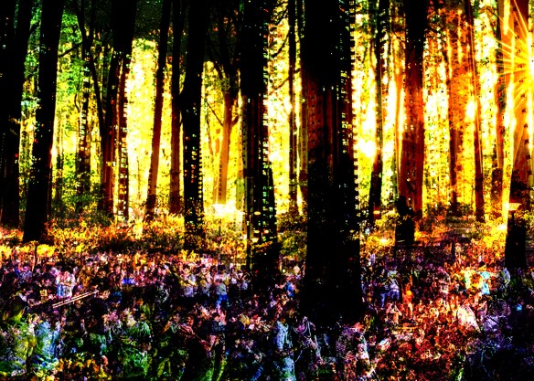
Petervan Photoshop collage as part of study on Peter Doig
Theme: Culture and Nature – Dec 2016
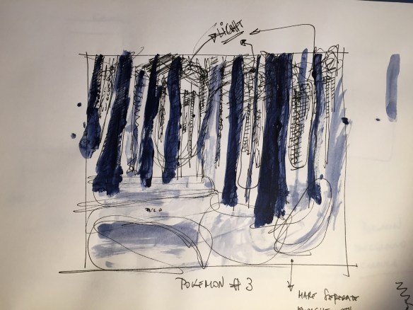
Pre-Study Peter Doig - Sketch Dec 2016
Happy New Year to you, your friends and your family! Hope you are doing well.
As you know, I left Innotribe/SWIFT in Nov 2016 for a long term sabbatical to create my own thing under the Petervan Productions umbrella. My ambition is to architect and create high quality feedback loops to enable immersive learning experiences and deep change.
A quick update:
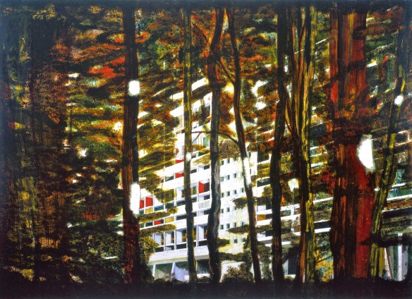
“Concrete Cabin” by Peter Doig - 1992
During Jan-March 2017, the plan is to work on:

Extract project plan performance per week.
I am very focused (yes, working on a 8+ hour daily schedule and a project plan). I am about one week late compared to initial plans. Being focused also means saying “no”. As you may have noticed, I have drastically dimmed my social media activities, and kindly reject any requests for consultancy, speaking engagements, etc.
I have 1-2 leads that want to work with me as their architect for immersive learning experience events. But I am not in active prospection mode.
Every request for collaboration is assessed against the objectives and priorities for 2017: the art, the performance, the retreat, the festival, and to see how far I can get with all that in one year’s time.
If there is something worth reporting, next update is for Feb 2017. Looking forward to hearing from your latest adventures as well.
Rebelliously yours,
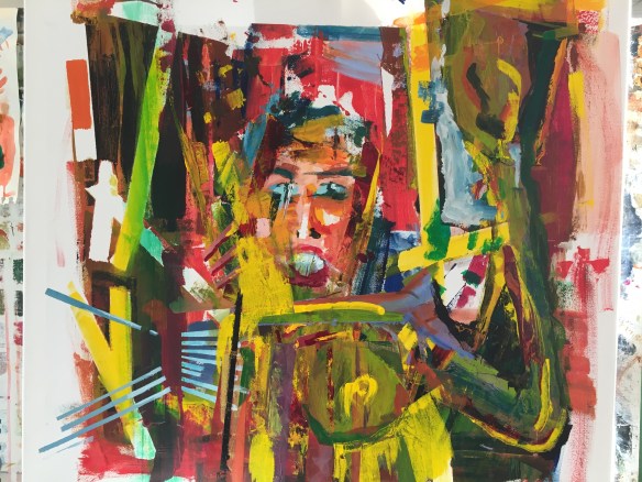


Artschool 2016. Study on Magnus Plessen.
1) V4 of painting based on collage 2), 3) and 4) some details.
Expect to finish next week. Acryl on cotton canvas 80x80cm, brush, spatula, kleenex.
With thanks to my coach Ann Grillet
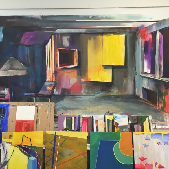
Collection of artworks from my fellow students of the 2016 Art class
My good friend Alan Moore (@alansmlxl) from the flatlands of Cambridge recently published a great book on “Why beauty is key to everything” (Amazon Affiliates link).
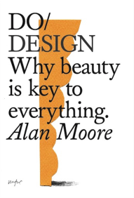
It’s a great book, and as a teaser, here are some of my highlights out of the book:
Harmony, symmetry and maths all point to this atomic elegance.
A job well done is not based upon watching the clock or fighting time – but in giving oneself to the task
Their work transformed common objects into works of uncommon grace
I believe great work comes from a place of stillness where one’s focus is total on the action in hand, directed fully by the heart.
We need to open our senses to all that surrounds us
To be and to remain deeply intensely curious about our world is vital to original thinking, whereas the incurious face a rather dim future. To have a hungry heart and mind determines what it is we create
The interface with design is humanity
I don’t need to draw conclusions, I am happy for the thoughts to be half-formed but present
Do not work with people who don’t want beautiful, who wish to cut corners to increase profitability. Who, more dangerously, bring neither elegance nor grace to their work and their working environment, but the opposite.
The danger for the leader comes if you cannot truly love yourself. If you are at war with yourself then you will be unable to lead others with empathy and compassion. You may pretend – but you will always be found out
If you want more of this, Alan is organising on 27 Sep 2016 a workshop in London around the idea of, what would your business look like were it to be more beautiful?
Why should you come? You might be stuck in working out what direction to go in. Or seeking a more inspiring vision. Or trying to find new ways to make money. Or working out what your new technology can truly give to the world. You might be launching a precious new business, or working to rebuild an old one. Or a thousand other things besides. We will help you to:
The gathering in a beautiful old church in Bishopsgate, London. A remarkable space in the centre of skyscrapers.

I read the book, and if the workshop is as good as the book, I strongly recommend it. More info about the event here. Enjoy
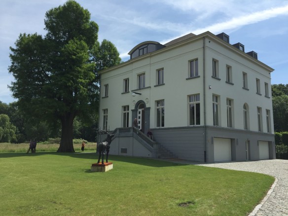
The White House Gallery in Lovenjoel - Belgium
Last friday was the last official school day of this season’s art school. On this wonderful summer afternoon, we went for an excursion to the exhibition of the work of Greet Van Autgaerden, in the White House Gallery.
The white villa used to be part of the complex “Groot Park”, initially a holiday property of the family de Spoelberch , one of the richest families of Belgium, and currently main shareholder of the InBev brewery imperium.
Maximiliaan de Spoelberch had a passion for dendrology (the scientific study of trees) – everybody needs a hobby – and create on the site one of the most unique collections of exotic trees in Europe.
In 1915, the land and property was gifted to KUL (University of Leuven), who rented it to the “Sisters of Love” in 1926, who set up a psychiatric hospital for women “Salve Mater”.
End of the 90’ies most hospital units were integrated into the University Hospital of Leuven. These days, real estate developers are transforming the main buildings into luxury apartments.
The white villa, was the residence of the Sisters of Love, and it was sold together with 11 hectacres of land to the current owners of the White House, who completely restored it and created a fantastic art gallery (RSVP only).

Point of View #10 - Greet Van Autgaerden - Oil/Canvas - 200*130cm - 2016
I was not only baffled by the great artwork of Greet Van Autgaerden – exposed over four different floors – but also by the stillness of the building, the great care of the restoration, and the hospitality of the owners Bert & Elly.
The title of the expo was “Point of View” as most of the works from Greet Van Autgaerden are landscapes. There was a great welcome-text by Hans Martens describing her work (abstract below):
Greet Van Autgaerden knows that a good painting is always kind of an ambush, and she enjoys luring us, as viewers, into her trap. I cannot shake off the impression that she too perceives the canvas as a “battlefield”, an arena in which she wrestles with the demons of painting – not in a romantic, tormented way, but in one that is analytical and acute, and which takes careful account of the various possibilities of an image. It reminds me more of the British approach, as exemplified by Constable, than the Germanic Sturm und Drang.
The visit made me reflect about what i want, in the true artistic creative-orientation sense, not in the BAU daily reactive/responsive tactics on how to solve a particular problem, which more and more drives us collectively into a solutionalist society, with superficial contacts and interventions, never even coming close to deep and inspired work.
In the middle of these first world reflections, I bumped into this wonderful object:

Christoph Fink, The Montreal Walks (12 254,94 km, 195 h 30’51"),
space and time disc, 2008. Ceramics, diameter 47cm.
+++ text by Joëlle Tuerlinckx – artist +++
While journeying by foot, bike and aeroplane, Christoph Fink gathers and transforms precise data through a unique notation system, and his clay and ceramic discs spring from this process. This study is sustained by research into the different periods of earth’s evolution, its ecosystem and geography as shaped by the political. It leads to a representation of the globe, or, more precisely, a representation of the globe’s space-time (the central void embodies space-time to come). The clay ball is fashioned according to detailed calculations, and engraved with ‘moments of knowledge’. I’m amazed by the way Fink manages to convey his vast research and his exceptionally rich understanding of the world with such minimal means. Like me, he’s fascinated by the complexity of reality, in which he finds beauty and rebellion.
Fink’s works defy categorisation, they stand somewhere between cartography, music, sculpture, drawing, and evoke a time where painter and geographer were one and the same person (the geographer’s job was still be invented). The amount of work that forms the basis of his practice is truly admirable, because so rare today. His numerous studies, sketches, researches and notations demonstrate a total commitment, every day renewed, and miles away from the art world system, with its fairs, galleries, museums … Fink builds his own vision of the world, one which is radically ethical, political, poetical, and directed only towards more freedom. This artist was for me an obvious choice because of his ethics, so urgently needed. May they inspire many others to find and further their own artistic journeys.
+++ text by Joëlle Tuerlinckx – artist +++
I found many more images of Christoph Fink’s work by a simple google search. If you do so as well, you will find many field notations like the one below.

Christoph Fink notations of a field trip
I love the concept of “field notations”, and never realised you could push the concept so far and in so much detail. And it is not about the destination, but the journey itself. Also labelled “trajectories” by Kevin Kelly in his latest book “The Inevitable: Understanding the 12 Technological Forces That Will Shape Our Future”, when describing “Protopia”, the mild process and progress, as opposed to Utopia and Dystopia.
It also made me think of a quote by Kristien van Looveren from 2009 (seen at the expo about architect Christian Kieckens, i just got in the last day last week in De Singel in Antwerp):
The works of Greet Van Autgaerden, Christoph Flink, Kevin Kelly, and my teacher Ann Grillet are ongoing inspirations in my quest for purpose and what i will do next.
Compared to those masters, I am such a newbie. Which also gives me the right and freedom to not knowing the norms, and therefor not even knowing how to respect them. That’s of course a false excuse for having a year-end academy scratch book, that not even gets close to any of the beauty I could witness this week-end.

My scratch-book with "extensions"
at the end of the first year art-academy painting
Snapshots from Petervan’s Artwork

Petervan Abstrakt Motiv 388 - Acryl on Paper - A1 Format

Petervan Abstrakt Motiv 389 - Acryl on Paper - A1 Format

Petervan Abstrakt Motiv 390 - Acryl on Paper - A1 Format
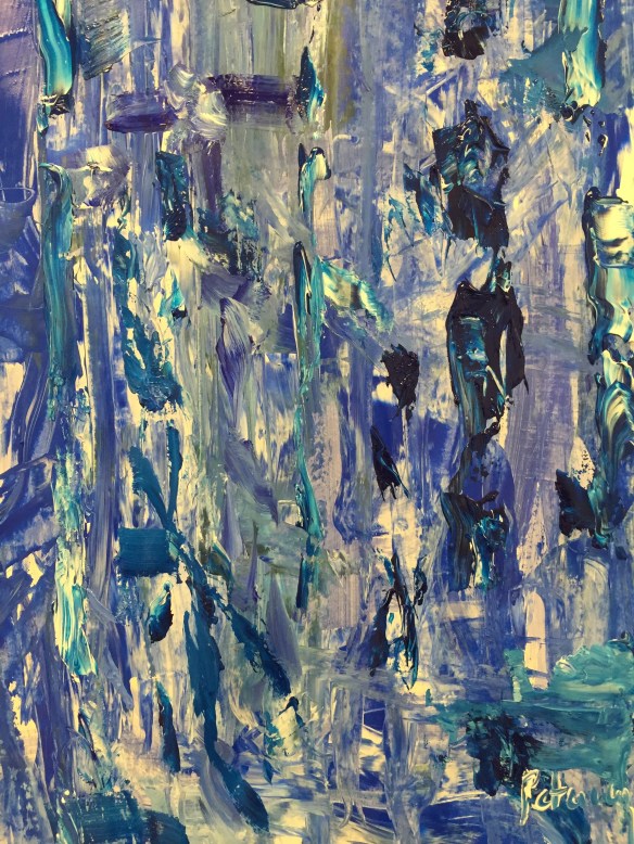
Petervan Abstrakt Motiv 391 - Acryl on Paper - A1 Format

